A research poster should demonstrate your key findings clearly and concisely, allowing you to kickstart conversations around your work in class and at conferences and exhibitions. But how do you create a research poster? Here are some tips from our proofreaders.
1. Planning a Research Poster
When you start planning your research poster, check the guidelines for the event where you will be presenting it and make a note of the following:
- The submission dates.
- The size requirements for your poster.
- Any institutional logos or affiliations you need to include.
- Whether you need to include funding information.
Next, think about your audience:
- Who will be looking at your poster?
- How knowledgeable are they likely to be about your topic?
- Where will they see your poster, in a classroom or at a conference?
You can then use these notes to guide your poster design.
2. What Software Should I Use?
You have several options for software you can use to create a research poster. One is Microsoft PowerPoint, which you may already have installed on your computer. This program is easy to use and there are free poster templates available for download.
However, PowerPoint is limited as a design program. As such, you may want to explore other options such as Microsoft Publisher, Adobe Illustrator, or InDesign. These may take a little while to learn if you haven’t used them before, but they may let you achieve much more professional results.
3. What Your Poster Should Include
Before you start writing, think about what you want to say. You will need to ensure your audience can identify the subject and key results of your research at a glance. To this end, your poster should include:
- A title that immediately tells your audience what your research is about.
- A clear introduction that sets out the purpose of your study.
- The methods and procedures you used to find the results.
- A brief discussion and conclusion that sums up your outcomes.
- A reference list (if required).
- Your name(s) and contact information.
Make a note of all the information you need to include, but remember that you have limited space to work with and stick to the most important details.
4. Research Poster Layout and Design
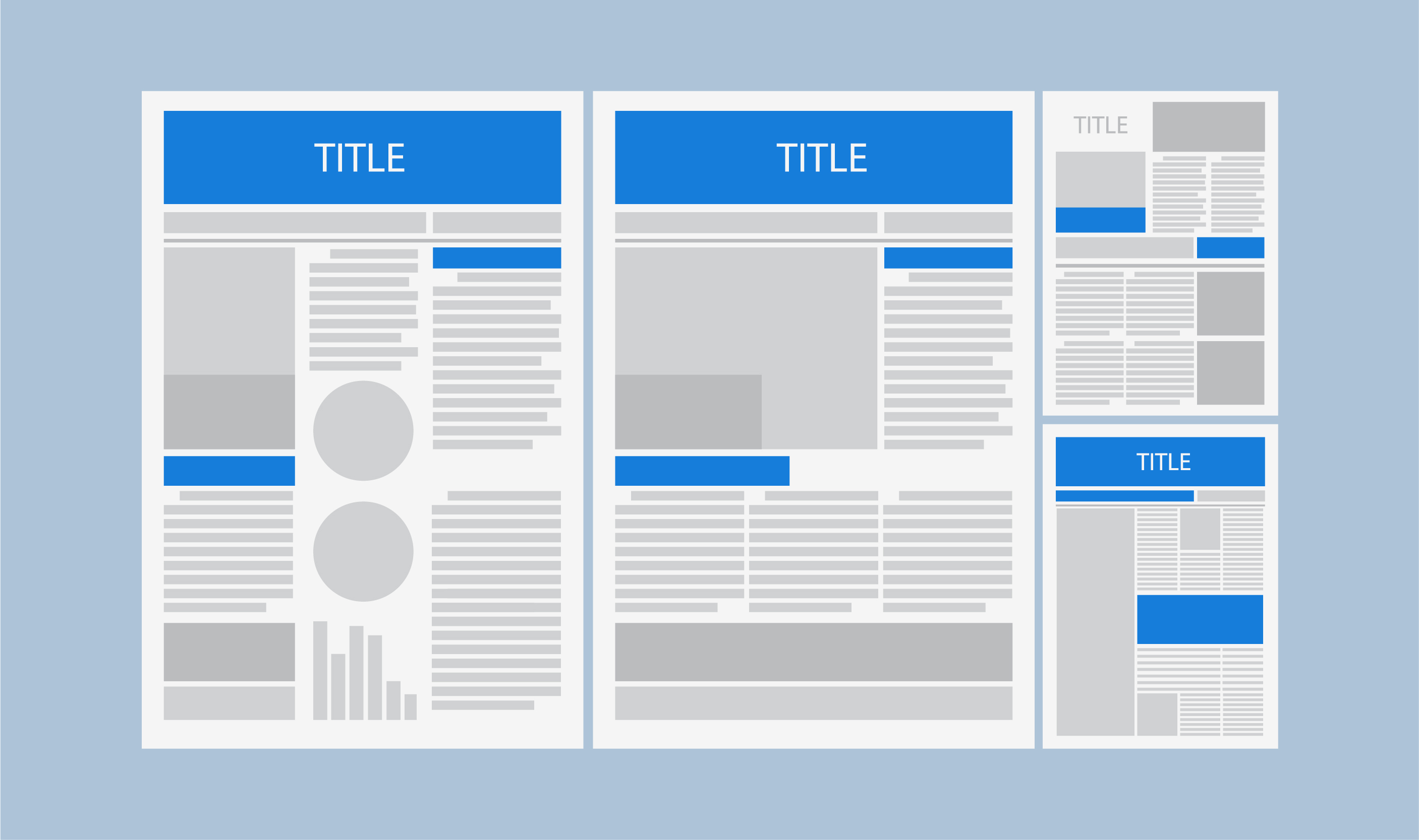
A good research poster should have a clean and consistent layout. Usually, this will consist of two to four columns (any more and your poster may become hard to read), including text and graphics.

In terms of where to put everything, think about how people read in English (i.e. left to right and top to bottom). Most research posters follow a similar format, with the introduction at the top of the leftmost column and the conclusion and references at the bottom of the rightmost column.
Find this useful?
Subscribe to our newsletter and get writing tips from our editors straight to your inbox.
Beyond this, other poster layout tips to consider include:
- Stick to clear, easy-to-read fonts and don’t use too many (one for your title and headings and another for your text should suffice).
- Make sure text is large enough to read at a distance.
- Use bold fonts for key terms and phrases to make them stand out.
- Choose a colour scheme with two or three colours.
- Stay away from excessively bright colours as they can be distracting.
- Do not use patterns, gradients, or photographs for the background of your poster, as they can make the text on top harder to read.
This will make your poster pleasing to look at and easy to read!
5. Writing Style
When you come to write up the text for your poster, remember to:
- Be concise (around 100–200 words per section is usually enough).
- Tailor the language to your audience throughout (e.g. if you were creating a poster for non-academics, you would avoid dense technical language).
- Write in the active voice where possible.
- Use headings to guide your reader through the poster.
- Use bullet points and numbered lists to make your poster easier to read.
This should ensure you can get your point over quickly and effectively.
6. Images, Tables and Charts
Graphics, such as images, tables and charts, are an excellent way to share your research. Minimally, you should include tables and charts to present your results in an easy-to-digest way, but think about whether other illustrations or images could help, too.
If you do include any graphics, make sure to use high-resolution images (between 200 and 300 ppi) so they will look good when printed.
7. The Final Check
When you have created a first draft of your poster:
- Print an A4-sized colour test print to help you find any errors.
- Assess the layout, colours, fonts, and graphics in your poster.
- Make sure your poster follows the size guidelines set out by the event at which you’ll be exhibiting.
- Proofread all the text on your research poster carefully.
This final point is very important, as a research poster filled with errors or typos will undermine the expertise that you are trying to project.
If you spot any issues, make sure to correct them and create another test print. And once you’re happy with your draft poster, that’s it! You are ready to send your masterpiece off to the printers.


